Start with the bakery's actual communication problem
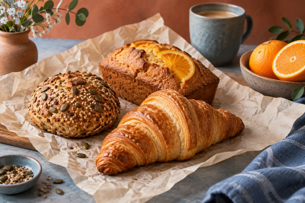
A neighborhood bakery does not need every social post to look like a national advertising campaign. It needs people nearby to understand what is available, when they can buy it, and why a visit would fit into their day. This Picsart AI social design guide develops a fictional campaign for Corner Crumb, a small bakery introducing a Saturday breakfast collection. The example combines real product photography, generated decorative backgrounds, clear typography, and a repeatable set of layouts. The objective is useful local communication with a recognizable visual identity.
Corner Crumb is fictional, and the campaign described here is a planning exercise rather than a report of business results. Its imaginary menu includes a seeded breakfast roll, a plain butter croissant, and a small orange loaf. We will keep those products visually distinct, show their actual appearance through source photographs in a real production, and use AI generation mainly to explore surrounding visual treatments. A generated croissant that looks more generous than the item on sale would create the wrong expectation, however attractive the image might be.
Picsart provides creative editing tools, including an AI image generator and background removal. The exact controls, asset access, and export options available to you can depend on the current product and account. This guide therefore describes decisions and production steps without pretending that every reader sees an identical interface. Use the tool that performs the required operation in your available workflow, and check the result rather than assuming a feature name guarantees a finished design.
The campaign will include a main announcement, a three-card product carousel, a process story, a pickup reminder, and a simple menu graphic. Each piece has a different communication job. They share colors, type rules, and image treatment, but they do not repeat the same headline with a different crop. That balance between consistency and purpose is the central design challenge of a small social campaign.
Write a brief that can settle disagreements
Before opening an editor, write a one-page brief. Corner Crumb wants nearby residents to consider collecting breakfast on Saturday morning. The audience includes people walking to the park, parents planning a relaxed weekend meal, and commuters who normally pass the shop too quickly to stop. These are plausible audience situations, not demographic claims derived from research. In a real project, replace them with knowledge from staff conversations, customer questions, and existing business data.
The message hierarchy has three levels. First, Saturday breakfast is available at Corner Crumb. Second, the collection contains three clearly named products. Third, the post tells the reader how to check availability or place an order through the bakery's verified channel. Prices, opening hours, and collection details must come from the business owner. Keep placeholders in working files until those details are confirmed rather than allowing a designer or generator to invent them.
Define the desired tone as warm, practical, and lightly playful. This rules out some tempting visual choices. A luxury black-and-gold treatment might make the bakery feel expensive and formal. A chaotic collage with many stickers might hide the food. A clinical white catalog might lose the neighborhood character. The brief does not dictate every aesthetic decision, but it gives you reasons to accept or reject a direction.
Write a measurable communication test: a person seeing the announcement briefly should identify the bakery, understand that the post concerns Saturday breakfast, and find the next action. This is not a promise of sales growth. It is a design requirement you can evaluate before publication. If the image is beautiful but the reader cannot tell whether it advertises a class, a recipe, or a product, the design has not solved the brief.
Gather source material before generating backgrounds
Collect the real assets the campaign depends on. These include the bakery logo, current product names, approved prices if used, shop address, opening information, and a small set of recent product photographs. Ask for the original files rather than screenshots copied from a messaging app when possible. Higher-quality sources give you more room to crop and edit, and they reduce the temptation to conceal technical problems with excessive effects.
Photograph each product from at least two useful angles. A three-quarter view can show the croissant's volume, while an overhead view may suit the orange loaf slices. Keep light direction consistent within the set. A product lit strongly from the left will be difficult to place convincingly in a background whose shadows clearly fall the opposite way. Consistency at capture saves time during editing.
Include one image that shows scale naturally, such as a roll on the bakery's actual plate or beside its usual paper bag. Do not use a prop that accidentally makes the product appear larger. If hands appear, obtain appropriate permission and make sure their role is clear. The product images should be trustworthy enough to carry the campaign even without any generated elements.
Create a separate inspiration folder for mood and composition. Keep it distinct from usable production assets. An image found online may suggest a color relationship without being available to copy into the campaign. Record where references came from and what you learned from them. This small habit helps the team discuss visual ideas without confusing inspiration with permission to reuse someone else's photograph or design.
Choose a small visual system for Corner Crumb
The fictional bakery's palette uses warm cream, toasted brown, soft terracotta, and a muted blue accent. Cream provides a calm base, brown connects to baked surfaces, terracotta adds warmth, and blue gives practical information a clear place to stand out. You do not need all four colors in every post. The system works because their roles remain consistent across the campaign.
Choose one clear display typeface for short headlines and one highly readable text face for details. If the bakery already has established fonts, use those instead of creating a competing identity. Keep important information in editable text layers. AI-generated lettering may be useful as an exploratory visual effect, but a pickup time or price must be easy to proofread and change. Accurate typography is part of customer service.
Set a few layout rules. Headlines occupy the upper portion of most posts, food remains the largest visual element, and a small brand mark sits in a consistent corner when space permits. Details appear on a solid or quiet area rather than directly over a busy crust texture. These rules help the campaign feel connected without requiring every design to use an identical template.
Choose a texture policy as well. A subtle paper grain or a lightly imperfect drawn line can suggest handmade care. Heavy distressed overlays can make food look dirty or obscure details. For Corner Crumb, use texture around the product, not across its surface. The real photograph should still show the food clearly. The campaign's warmth comes from thoughtful arrangement rather than from coating every element with decoration.
Assign a role to every campaign asset
The main announcement introduces the collection and provides the broadest context. It should show all three products or a representative arrangement, state the Saturday breakfast idea, and direct people toward verified ordering information. It does not need a paragraph about each item. Its role is to establish the event and make the campaign recognizable when later posts appear.
The product carousel gives each food its own moment. Card one introduces the collection, and the following cards explain the seeded roll, croissant, and orange loaf separately. If the platform or planned format uses fewer cards, adjust the sequence without forcing too much information into one image. The design should support a simple question: what is this item, and why might I choose it?
The process story adds human context. It might use real photographs of shaping dough, preparing trays, or arranging the shop counter. Do not generate fictional behind-the-scenes images and present them as evidence of the bakery's actual process. If an illustrative scene is used, make its illustrative nature clear. Trust is more valuable than the appearance of a perfectly documented production day.
The pickup reminder and menu graphic are practical assets. They should prioritize confirmed hours, collection instructions, and product names over visual novelty. A reminder seen while someone is walking outside needs a different information hierarchy from an announcement viewed leisurely at home. Treat these pieces as service design within the campaign. Their success comes from reducing uncertainty, not from adding another dramatic image.
Prepare food cutouts with careful edges
Background removal can make real product photography flexible, but the cutout deserves close inspection. A croissant has thin tips, flaky edges, and small gaps that may be mistaken for background. A seeded roll has irregular texture that can become unnaturally smooth if the mask cuts too aggressively. Inspect the silhouette on both a light and a dark temporary background before using it in the final design.
Look for halos around the crust. A pale fringe may be invisible against the original light table but obvious on a terracotta background. Refine the edge if your workflow allows it, or choose a background close enough in tone that the transition remains natural. Do not solve every mask problem by adding a heavy outline. An outline changes the visual style and may make food look like a sticker when the campaign needs appetite and realism.
Preserve the original product color. Basic exposure and white balance corrections can help a photograph match the actual item, but increasing warmth and saturation indiscriminately may make the bread look overbaked or the orange loaf unusually vivid. Compare against the original photo and, if possible, the product itself. The goal is a clear representation, not the most intense image available.
Keep contact shadows on a separate layer when practical. A cutout floating above a background looks disconnected, while an excessively dark shadow makes it seem heavy or artificial. A soft shadow directly beneath the product can establish contact. Its direction and softness should agree with the source lighting. This small detail often contributes more credibility than an elaborate generated background.
Generate a background that leaves room for the message
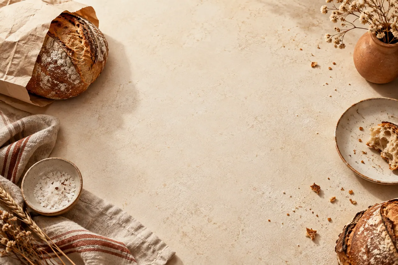
The strongest background prompt describes a stage for the real product rather than asking the generator to design the entire advertisement. For the announcement, Corner Crumb needs a warm tabletop, gentle morning light, and a quiet upper area for a headline. It does not need imaginary pastries, illegible logos, or a fully furnished cafe interior competing with the actual food photographs.
A simple warm cream tabletop scene for a neighborhood bakery breakfast announcement. Soft natural morning light enters from the left and creates a gentle shadow toward the right. The lower half has a subtle paper placemat and generous open surface for placing photographed bakery products later. The upper half remains calm and uncluttered for editable headline text. Restrained toasted brown and muted terracotta accents, approachable everyday atmosphere, realistic surface texture. No food, lettering, logos, people, or decorative signs.This prompt is a starting brief for AI image generation, not a guarantee of exact layout. Inspect the output for unwanted objects and for the actual usable area. A background can technically contain empty space while still being too visually busy for text because of bright highlights or strong texture. Place a temporary headline over it before deciding that it works.
If the generated surface feels too polished, simplify it. A plain cream field with a faint shadow may serve the campaign better than a photorealistic scene. The real food should remain the focus. The background's job is to establish light, mood, and compositional support. It succeeds when the reader notices the product and message before thinking about how the backdrop was made.
Assemble the main announcement in layers
Build the announcement from back to front. Start with the background, add the product cutouts, establish shadows, place the headline, then add the brand and practical information. This order helps you judge relationships rather than decorating around a fixed text block. Keep each major element editable so that a late change to opening hours does not require rebuilding the entire image.
Arrange the three products with a clear dominant item. If every object has the same visual weight, the composition may feel static or crowded. Let the roll sit slightly forward, the croissant support the left side, and the orange loaf provide a lower horizontal shape. These are fictional layout suggestions, not instructions to distort actual product size. Maintain plausible relative scale based on the source photographs.
Use a short headline such as Saturday Starts Here, followed by a smaller line naming Corner Crumb's breakfast collection. The headline creates tone; the supporting line explains the offer. If only the playful headline appears, a new viewer may not understand the post. If every detail appears in equally large text, nothing feels important. Hierarchy allows personality and clarity to coexist.
Add a temporary safe area around the edges and preview the design at a small size. Avoid placing essential words close to a crop boundary or interface overlay. Platform presentation changes, so inspect the current publishing preview before posting. A design that looks balanced in the editor can become awkward when shown in a feed, profile grid, or story view with surrounding interface elements.
Use the carousel to answer different questions
A product carousel should offer a reason to continue swiping. Instead of repeating the same image with slightly different headlines, assign a question to each card. What is in the collection? What makes the roll useful for breakfast? What is the croissant's texture? How is the orange loaf served? The answers must come from the bakery, especially when they concern ingredients, allergens, or preparation.
For the fictional seeded roll card, show a real photograph large enough to reveal the crust. Place the product name in a consistent position and use one short descriptive sentence approved by the business. Avoid unsupported superlatives such as the healthiest breakfast or the city's best bread. Concrete information is more useful: the item is a seeded roll, it is sold individually, and it is part of the Saturday collection.
The croissant card can use a tighter crop, while the orange loaf card can show a slice beside the whole loaf. This variation prevents the carousel from feeling mechanically repeated. Keep the type scale, palette, and spacing rules consistent so that the variation reads as deliberate. A common footer or small progress cue can help readers understand that the cards belong together.
End with a practical card that gathers the confirmed next step. If orders are taken through a website, name that destination clearly in the post copy or appropriate link location. If availability is first come, first served, say so accurately. The final card should reduce the gap between interest and action. It should not invent scarcity or pressure simply because urgency is common in advertising templates.
Turn process photographs into a credible story
A process story can communicate care more effectively than another product glamour shot. For Corner Crumb, imagine three real photographs: dough being divided, trays arranged before baking, and the counter prepared for opening. Each photograph should show something that actually happened at the bakery. The captions can describe the action in ordinary language without turning every moment into a grand brand claim.
Use a lighter design treatment than the announcement. A small caption panel and consistent corner mark may be enough. Heavy generated backgrounds would distract from the documentary value of the photographs. If the original image has an untidy but harmless background, consider whether a crop solves the problem before removing objects. A believable working environment can feel more welcoming than an impossibly spotless scene.
Obtain consent for recognizable staff members and respect the bakery's preferences about showing work areas. Do not publish private schedules, order slips, customer details, or other information visible in the background. These are concrete production checks, not a reason to make the design process cumbersome. A quick review of each photograph often identifies the issues before they become part of a public asset.
Keep the narrative sequence simple: preparation, transformation, ready for customers. You do not need to claim that three images show the entire baking process. A short label such as A Few Moments Before Opening sets an honest expectation. The story adds texture to the campaign because it shows real people and work, while the AI-assisted graphics provide consistency around those moments.
Design reminders for hurried readers
The pickup reminder has a different job from the announcement. Someone who already knows about the collection may only need the date, time, and collection method. Make those details visually dominant. A small product image can support recognition, but it should not push the essential information into tiny text. The reminder succeeds when a reader can act without opening several earlier posts.
Use a solid or nearly solid background with strong text contrast. The muted blue accent can distinguish practical information from the warmer announcement assets. Keep the bakery name visible because social posts can be shared outside their original context. A reminder that says Tomorrow Morning without a business name or date becomes confusing when viewed later or forwarded to someone else.
Write dates explicitly in the final approved version rather than relying entirely on relative terms. Confirm the time zone only if the audience or ordering process makes it relevant; a local bakery generally communicates in local time. Check that the graphic and post caption agree. A correct image paired with outdated copy still creates a customer problem.
If the bakery needs to update availability, create a separate editable status version rather than scribbling over the original announcement. This might say that one item has sold out while the others remain available, provided the information is current. Clear updates respect the reader's time. They also demonstrate why editable text layers and a simple layout system are valuable beyond the initial design session.
Keep menu information outside the image generator
A menu graphic contains facts that deserve direct control: product names, quantities, prices, and any approved notes. Enter these as real text and proofread them independently of the visual design. Do not ask an image generator to produce the complete menu and then assume the lettering is correct because it looks convincing from a distance. Small substitutions can change meaning or make the business appear careless.
Use alignment to make comparisons easy. Product names can share a left edge, while prices occupy a consistent position if prices are included. Keep spacing large enough that each item forms a clear unit. Decorative dividers should not look like minus signs, decimal points, or ingredients. In a compact menu, visual clarity matters more than ornamental variety.
Allergen and dietary statements must come from the bakery's verified information and appropriate labeling practices. A designer should not infer that an orange loaf is dairy free from its appearance or that a seeded roll is suitable for a particular diet. If the graphic cannot contain all necessary detail, direct readers to the bakery's authoritative menu or staff. Avoid vague icons whose meaning is not explained.
Save the menu source separately from flattened delivery images. A business may change a price or remove an item later, and a clean source file makes that update straightforward. Add a version date in your internal filename or notes so the team knows which menu is current. That internal housekeeping reduces the risk of accidentally republishing an old graphic during a busy week.
Adapt compositions instead of stretching them
A square announcement, a tall story, and a wide header need different arrangements. Resizing the same flattened image can crop essential information or shrink text until it becomes unreadable. Start from the editable layers and rearrange them for each format. The brand system supplies consistency while the composition responds to the available space.
In a tall story, stack the headline, product group, and action vertically. Leave room where the publishing interface may place controls or captions. In a square post, a broader product arrangement can sit beneath a compact headline. In a wide banner, the food can occupy one side and the message the other. These are spatial decisions, not merely changes in export dimensions.
Check the product cutouts after every adaptation. A croissant placed near the edge of a tall layout may lose a tip when cropped. A loaf slice may become so small in a wide banner that it looks like an unrelated shape. Preserve the features that make each product recognizable. If space is limited, reduce the number of products shown rather than compressing all three into an unreadable cluster.
Use the current platform preview as the final authority for presentation. Interfaces and recommended dimensions can change, and a general tutorial cannot guarantee every crop behavior. Inspect the actual post before publication, including how it appears on a phone. The process should end with a readable message in its real context, not just a correctly sized file in a folder.
Write social copy that complements the graphic
The image should communicate the essential idea quickly, while the accompanying copy can add detail and personality. For Corner Crumb, the announcement caption might explain that the fictional collection brings together three breakfast options and point readers toward confirmed availability information. It does not need to repeat the headline word for word before saying anything useful.
Keep factual claims specific and supportable. If the bakery makes the products on site, the business can confirm that statement. If a recipe uses local ingredients, verify which ingredients and what local means in that context. Avoid inserting broad claims about sustainability, health, or popularity because they sound appealing. The strongest small-business voice often comes from concrete details the owner can confidently stand behind.
Use a clear action suited to the actual process. Check the menu, place an order, visit during opening hours, or ask staff about availability are different actions. Choose the one that helps the reader next. Multiple competing instructions can dilute the message, especially when the visual already contains several products and a date.
Proofread the caption beside the final image rather than as a separate document. Look for mismatched product names, contradictory hours, and duplicated information that makes the post unnecessarily long. Read it aloud to check tone. A sentence that sounds natural in a conversation with a regular customer will often fit a neighborhood bakery better than a string of marketing slogans.
Make images understandable beyond visual styling
Alternative text should describe the meaningful visual content of a social image or website asset when the publishing destination supports it. For the main announcement, describe the three bakery products arranged on a cream background and include essential visible wording if that information is not available elsewhere. Do not fill alt text with repeated brand keywords. Its purpose is to communicate the image to someone who cannot see it clearly.
A product carousel may need different descriptions for each card. The seeded roll image should describe the roll, while the croissant card should describe the croissant's presentation. Reusing one generic description across every card loses useful information. If the accompanying text already provides the full menu, the alt description can focus on the visual arrangement without unnecessarily repeating every detail.
Check contrast and text size in the final output. Warm cream and pale terracotta can look elegant together but may provide weak contrast for small letters. Use the darker brown or another suitable tone for important text. Avoid placing fine lettering over flaky crust or patterned paper. A quiet text area helps many readers, including people viewing the post outdoors or on a small screen.
Do not rely on color alone to distinguish products or availability. Labels and words should carry the meaning even if the colors are difficult to tell apart. If one card uses blue to mean available and another uses terracotta to mean sold out, include the actual status text. Accessibility is closely connected to practical clarity, which is already the campaign's main communication goal.
Review food realism and commercial accuracy
Before publication, compare every product image with its source photograph. Check the number of items, relative size, visible filling, crust color, and any distinctive decoration. A background edit can accidentally alter a product edge or add an object that appears to be included in the purchase. The review should catch these changes before a customer interprets them as part of the offer.
Pay attention to props. A plate, coffee cup, or jam jar can suggest a serving combination even if the post only sells a pastry. If those items are decorative and not included, make the overall presentation clear. In some cases, removing the prop is simpler than adding explanatory text. The design should not create an expectation that the caption must later undo.
Check the logo and any packaging marks. Generated backgrounds can contain accidental lettering or shapes that resemble brands. Remove distracting or misleading marks and use the bakery's approved logo file where branding is needed. Do not rely on a generated imitation of the logo, even if it appears close. Small inconsistencies are noticeable when the real mark appears elsewhere in the campaign.
Ask the owner or a knowledgeable staff member to approve the factual content. Their review should focus on products, prices, hours, and ordering details, while the designer checks visual clarity and file quality. Separating those responsibilities makes feedback more useful. A design can pass its aesthetic review and still contain an incorrect pickup instruction, so both perspectives are necessary.
Run a small creative test with a clear question
If the bakery wants to compare two announcement designs, decide what question the comparison should answer. For example, does a close product arrangement communicate the collection more clearly than a wider tabletop scene? Keep the headline, product information, and action consistent so the main difference is the composition. Changing everything at once makes the result difficult to interpret.
Before any live test, conduct a simple comprehension check. Show each design briefly to a few people who were not involved in production and ask what they think it advertises. Do they name breakfast, the bakery, and Saturday? Do they know what to do next? This feedback does not predict sales, but it can reveal obvious communication problems at little cost.
If the business later compares published performance, interpret results cautiously. Reach, timing, audience, weather, availability, and other factors can affect engagement or orders. A post with more likes is not automatically the better commercial design. Define the relevant outcome with the owner, whether that is menu visits, useful inquiries, or completed orders through a measurable channel.
Keep the learning specific. A useful note says that the wider scene made the product names too small on mobile, so the next version should enlarge the food and simplify the supporting line. A vague note saying that blue performs better is easy to overapply. The goal is to improve the bakery's communication, not to invent universal rules from a small campaign.
Maintain a production folder that supports updates
Organize the campaign around source material, editable designs, approved exports, and published versions. The exact folder names are less important than making their roles obvious. Someone helping the bakery next month should be able to identify which photograph is original, which layout is editable, and which file was actually approved. Avoid a folder full of nearly identical names ending in final-final-new.
Use descriptive filenames that include the campaign, asset role, format, and version. For example, a filename can identify the Saturday collection announcement and distinguish the square export from the story export. Keep internal version numbers out of customer-facing text. This naming system is administrative, but it prevents practical mistakes when several assets are being scheduled together.
Store the prompts used for generated backgrounds with a small preview and a note about edits. Record the actual tool or model chosen when available. If you adapt ideas from a GPT AI image generator prompt guide, do not label the resulting asset as a GPT image unless that tool actually produced it. Clear provenance helps the team repeat a successful treatment without making inaccurate claims about the production process.
Archive the approved copy alongside the images. Social captions, alt text, and publication notes belong to the campaign just as much as the visuals. A later update may need only a new date and a fresh product photograph, but it still benefits from knowing what was previously said. Good organization makes reuse deliberate rather than accidental repetition.
Build templates that preserve decisions, not stale content
After the campaign is complete, identify which parts deserve to become templates. The headline spacing, logo placement, color roles, and product-card hierarchy may be reusable. The exact Saturday date, prices, and food selection are not. A useful template protects the design system while making variable information obvious and easy to replace.
Create separate templates for announcement, product detail, reminder, and menu. One universal template often becomes crowded because it tries to serve incompatible needs. The reminder needs large practical text; the product detail needs a large photograph; the menu needs structured comparison. Let each template reflect its communication role while sharing the same visual identity.
Add a short internal note to each template explaining its intended use and the fields that must be checked. For example, the reminder template can require a confirmed date, time, and collection method. These notes should stay in the working file or accompanying documentation, not appear in the exported customer image. They help a busy staff member use the system correctly without needing a full design briefing.
Refresh the templates when the bakery's identity or audience needs change. Consistency is useful, but it should not freeze the business into an outdated format. Review whether the layouts still provide enough room for actual information and whether repeated posts remain readable. A template is a starting structure for a new message, not a reason to stop thinking about the person who will read it.
Finish with a publication check and a learning note
Open every final export at normal viewing size and verify the basics: the right product, the right text, readable contrast, clean cutout edges, and no accidental placeholder. Check the post copy and destination link at the same time. A correct graphic with a broken ordering link still fails the customer. The final check should follow the entire path from seeing the post to taking the intended next step.
Confirm that the published assets match the approved versions. Scheduling tools and shared folders can make it easy to select an earlier file by mistake. After publication, view the post in its actual context and inspect crops, text visibility, and caption formatting. Correct any clear issue promptly through the platform's available editing process, while keeping a note of what changed.
When the campaign ends, write a short learning note for the next one. Record which assets answered customer questions, which required clarification, and which production steps caused avoidable delays. Include practical observations from staff, such as repeated questions about collection times. These details can improve the next campaign more directly than a broad claim that AI made the work faster or better.
A strong Picsart AI workflow gives a small business more control over its visual communication. Generated backgrounds, image editing, and reusable layouts are useful because they support a clear message grounded in real products. Corner Crumb's fictional campaign demonstrates that the essential work remains familiar: understand the customer, represent the offer honestly, arrange information well, and make the next action easy to find.
Official sources and further reading
Use these first-party pages to confirm current product access and controls. Creative exercises in this article describe a proposed workflow rather than a claim that every control is available in every plan.